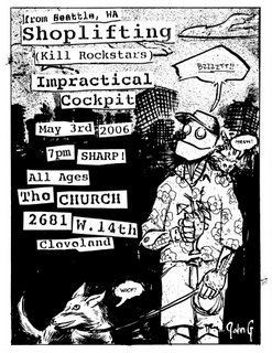
Did this flyer on Monday to promote the show on Wednesday. Kinda shitty, put it up on myspace and shit, but too late is too late. I didn't make any copies of it or anything. I'll print one for you if you'd like one. I'm kinda like, hitting this weird stride with these flyers where I have a specific approach for each place and like, genre of music. Then there's the time when I have absolutely no iudea what the bands sound like. I just usually base the pieces on the venue. This Shoplifting one was like that. It was set up by George from Steve Dracula, but I think Shoplifting got added to the bill later. Anyway, the show was awesome. Shoplifting is fucking great, and Impractical Cockpit is amazing to watch. In fact, I have a lot to say about the show in general, and I'll try and post more about it later. If I can find the time.

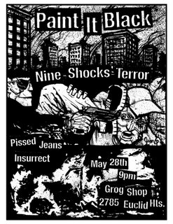
Paint it Black, Nine Shocks, Insurrect... I am too old for this shit. However, I still like to draw burning trucks, and robots with guns to their faces. I like violence as much as the next guy, but goddamn. I hope to start doing more flyers for the Grog. I have a lot of fond memories of seeing many great great shows there over the years. Mostlyy when it was down on Coventry. That space was so hagard.

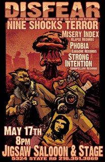
Nick Filardi colored this poster for me. I cried a little when I opened my email and this was attached. I love working in black and white, but if this is what can happen when a limited palet is applied... I'm like, gonna start pushing to get him to do this more often. Nick is also a wicked artist in his own. There's a link to his comics on the side bar to this blog. Check him out.

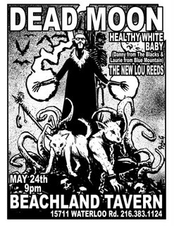
I have no idea what Dead Moon is all about but they have one of the worst logos I have ever seen for a band. It's a cresent moon with a skull poking out the side. I went with an insanely simple and legible font for this piece to make it as instantly recognizable as possible. Maybe went too simple. I dunno. I'm on the fence. I like it but I think maybe a slightly less common font would have been better and like, y'know, not as blah. Still, I spent a lot of time working on the art, so... yeah. Mignola should kick my ass.
I may be losing my internet connection at home, so these updates may be even less frequent than they have been. Which is pretty infrequent, but still... yeah. No money, and debt up to my eyeballs, and summer being around the corner. I might have to get a job. I don't want to do that. Fuck Jobs.

