I can't think because apparently there's an unscheduled TOWN FUCKING MEETING going on at the coffee shop. These dumb motherfuckers are standing AT MY TABLE and talking about the dumbest fucking shit. From going to Macy's to trash talk about some woman who was on an Angelo's Pizza flyer. My christ. Oh, and I realized the reason why nobody ever leaves any comments on my blog was that I never fucking approved anyy comments in the "moderate comments" section of my blog control thingy. So, if you left a comment and it never appeared, sorry. I approved them all so they're now there. Feel free to leave more. Please.
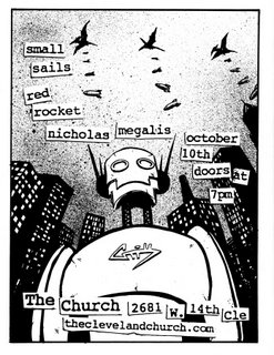
I really like doing flyers for The Church. I like the ability to both use the uniform look of using my standard "Church" text, with the xeroxed all to hell type. Also, I like robots, and pterodactyl, and bombs.

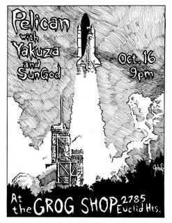
This Pelican flyer is a totally different direction from my usual dirty style. I wanted to branch out a little, and try and clean up my act. I used a photo ref and didn't deviate almost at all. I'm not sure if the cross hatch worked too well or not. I'm glad I lettered it by hand though, even if it doesn't look as pro as it could. Kinda roughens it up a little. SunGod is a pretty new Cleveland band. I'm excited to hear them, as I've been a fan of all the bands the members have been in and I generally approve of Sun Gods.

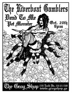
This last flyer for the Grog Shop was a total fucking BITCH to do. I didn't plan it out at all, but I kinda figured I would just get it off the ground as I drew it. I had a really small rough sketch in an old sketch book that was of a girl pirate riding over a sea of skulls on a giant spider. It was supposed to be a painting for my friend Sarah, who I lost a bet to last winter. I'm still gonna do the painting but I'm gonna plan it out a hell of a lot better than this flyer. So I did the art and used references all to hell for both the girl and tarantula. I opted to leave the skulls line art and not fill in the blacks like I usually would. Then scanned it and tried to letter it but nothing looked right. I had to wait to get online to download that goddamn font. Then nothing I tried looked anywhere near right. Man, Fuck this flyer. The one redeeming factor is the art itself. I think it came out fucking great and that chick came out better than I expected. I may even color it.

