
Thursday, March 24, 2011
Wednesday, March 16, 2011
Russian Roulette Frankenstein Melt

Available this Friday, March 19th, and Saturday the 20th, is The Russian Roulette Frankenstein Melt at Melt bar & grilled! This is such an awesome idea, and I'm really glad I was able to be a part of it, but it is pretty insane. The idea is that you order the Frankenstein, choosing your cheese, and your server will bring you a deck of 30 cards with various random Melt Add-Ons, of which you will pick four. Those four Melt Add-Ons will be your sandwich.
This, along with Machine Gun Joe's Sloppy Joe Melt of course, ties in with the midnight screening of Death Race 2000 at The Capitol Theatre, on West 65th Street, as part of Cleveland Cinema's Late Shift series. Death Race 2000, dudes. Roger Corman, a Cult Classic.

I really like this Death Race 2000 poster. I love the text. I tried to aproximate it as best I could but still do something slightly different. I think it worked. I gotta admit, I'm kind of in love with the fact that after doing a bunch of these movie posters I'm accruing a lot of versions of the works MELT bar & grilled in various type-styles and logos. It's fun.

Here's the final black and white line art for this poster:

Wait.... what? Enough with the art? Graphic design blathering is a boring snooozefest? What? You want to read more about the actual sandwich? The Russian Roulette Frankenstein Melt? Okay, okay... what do you want to know?
What are the 30 different Melt Add-Ons???? What various random food elements could end up on your Frankenstein Melt????? GOOD QUESTIONS, I'm glad you asked!
Here's the full sheet of the cards, arranged in suits and numerical order:

Here's the list, in case you can't read that jpg, not in any particular order:
1. Burger - grilled, blackened or diablo style
2. Chorizo
3. Chicken - grilled, blackened or breaded
4. Smoked Turkey
5. Ham
6. Bacon
7. Salami
8. Pepperoni
9. Pierogi
10. Spinach
11. Peanut Butter
12. Veggie Burger
13. Steak
14. Jalapeño Peppers
15. Fried Tofu
16. Napa Vodka Kraut
17. Caramel Port Onions
18. Fried Egg
19. Garlic Portabellas
20. Avocado
21. Double Cheese
22. Pickles
23. Roasted Red Peppers
24. Sweet Slaw
25. Hand Cut Fries
26. Grilled Tomato
27. Roasted Vegetables
28. Grilled Banana
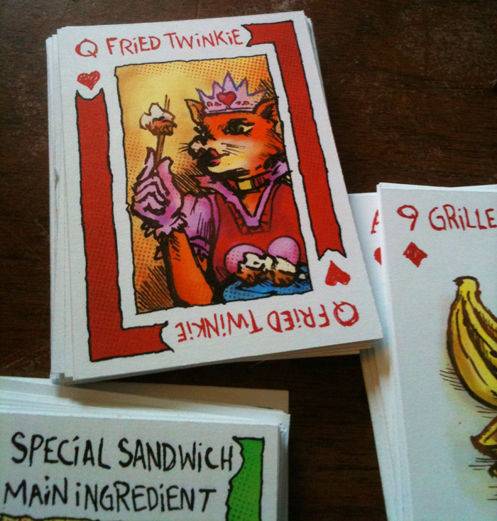
29. Fried Twinkie
30. Special Sandwich Main Ingredient
I assigned the different Add-Ons their card by drawing randomly from a deck of cards. Actually, believe it or not I didn't have a deck of cards so I used random.com's deck shuffler.

I drew the cards all out using grids, which is always ...rules. PUN INTENDED.

Inking the letters, sometimes you gotta go bananas, ignore the pencil, and make it pop. I shot these pictures with my iPhone. Not the best way to convey the graphic process, but it's what I got. 9 of Diamonds, a 1 in 30 chance of getting Grill-B's on your Frankenstein.

I actually ended up printing them in house on my Epson R1800, on 13" x 19" sheets of matte photo paper. I could only print single sided, so I had to also print the backs out then cement them together before laminating them and trimming them down.
I did all the drawing by hand but then colored them in Photoshop, which was fast for each card but then took forever to get through all 30. If you would like to check out the individual cards, I uploaded bigger jpgs of them all to this album here: FRANKENSTEIN CARDS.

There's the whole deck, laminated and ready to start making sandwiches! Seriously, how awesome would it be to end up with a Peanut Butter (Queen of Diamonds), Grilled Banana (9 of Diamonds), Bacon (7 of Clubs), and Fried Twinkie (Queen of Hearts) Melt? It would be FREAKISHLY AWESOME.

Here's a big giant jpg of my favorite card, the Queen of Clubs. The implication is that yes, these cards will now and forever be available for you to make a Frankenstein Melt any time you go to Melt and have no idea what you want on your gourmet grilled cheese sandwich. One of the Add-Ons you pick at random might be whatever the Special of The Month's Main Ingredient is... this month it would be Fresh Lean Corned Beef from the mighty Reuben Melt.
I encourage anyone that gets The Russian Roulette Frankenstein Melt to head on over to Melt's Facebook Page and report in on what your Melt Add-Ons were and how you liked it. Take a picture with your digital camera or cellular telephone and post it up! This is the Interaction Age, my friends. Take Heed!
In fact, speaking of the Interaction Age... I've been posting more up on Twitter recently, so if you use twitter and would like to follow me, it's @shinercomics Also, if you have some feedback to anything on this blog, feel free to comment on this post, or email me directly jgritty@gmail.com
I still have ONE Worryblind Print available in the Shiner Comics Store. That's a limited edition, and there will be only 4 of them, it's a steal at 40 bucks. Also still available is the Octopus drawing from this month's Dessert cards at Melt. If you're interested, keep an eye on http://shinercomics.bigcartel.com, where I will be posting other stuff soon!
Friday, March 11, 2011
My Machine Gun Weighs a Ton
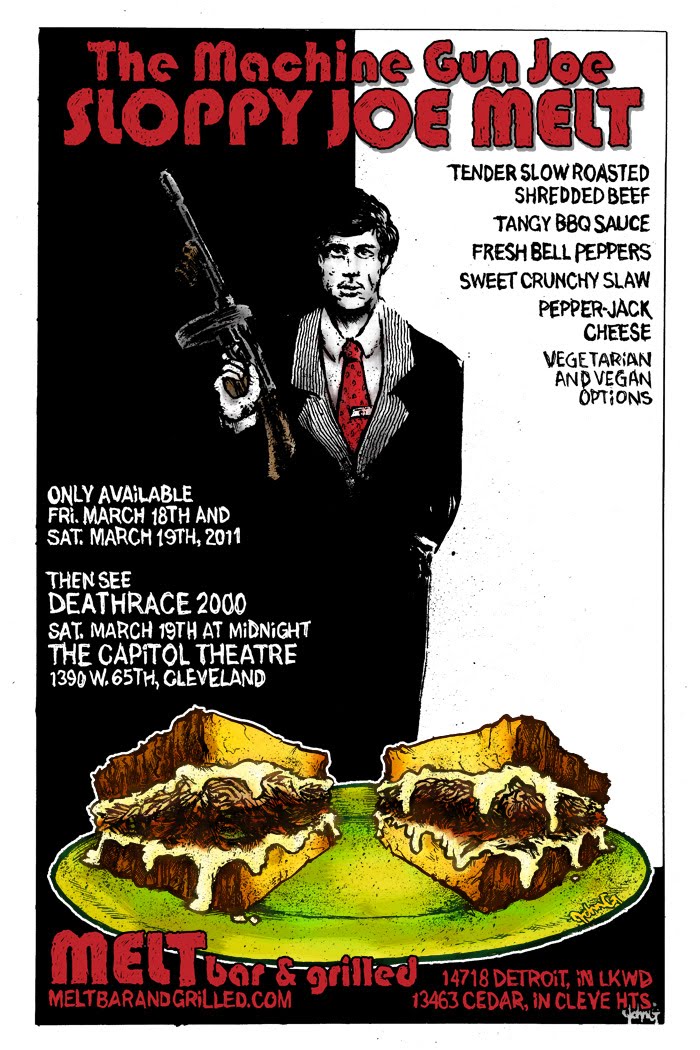
One week from right now is the window of opportunity for fans of eating off the hook sandwiches to get to MELT and give The Machine Gun Joe Sloppy Joe Melt a whirl. This is one of two sandwiches that tie into the midnight screening of the 1975 cult classic Death Race 2000 at The Capitol Theatre, over on West 65th Street, as part of Cleveland Cinema's Late Shift series.
Now, on with the details:
Tender Slow Roasted Shredded Beef
Tangy BBQ Sauce
Fresh Bell Peppers
Sweet Crunchy Slaw
Pepper-Jack Cheese
Vegetarian and Vegan Options

I actually drew the poster with Machine Gun Joe being a lot smaller on the page than he ended up, but realized I could bump him up a lot once I threw down all the text. This piece, of course, in a homage to one of the greatest movie posters of all time, that of SCARFACE. It's been bit on a majillion times by a zillion people, but I still felt the need to flip it a bit and make the suit he's wearing black and have him coming out if the shadows rather than being all white and facing them. Also, I felt like adding some touche of color so it didn't contrast too stark against the drawing of the sandwich. I toyed with the idea of making the art and sandwich black, white and red, but that train never left the station. Maybe I'll go back and try that?

I haven't seen Scarface in a long time, but man... what a great movie. I mean, it does kind of derail for me somewhere near the "Push it To The Limit" montage, but then that montage is so awesome on some level... I wonder if anyone's made a "Push it To The Limit" montage by taking scenes from the old 1932 Scarface, directed by Howard Hawks. I bet someone has. I bet that's out there.

I didn't want to abandon the look of the Death Race 2000 poster entirely, so I spent some time with the text treatments from it and made some moves that I think worked out pretty good. People designing text in the mid-seventies were pretty undeniably awesome. That must have been a totally weird time.
Anyway, if you haven't seen Death Race 2000, it would be totally fun to see on the big screen, and The Capitol is the place to do that. It's an beautiful theater. I might make it out, but honestly, I'll most likely be deep in the Graphics Mines digging up some raw mineral Art to forge into some more posters for you.
Sunday, March 06, 2011
Days Future Presesnt

That's from this week's Cleveland Scene Magazine. One of the bigger projects I'm working on at the moment is all the art for Scene Magazine's Best Of 2011 issue due out March 30th. It's a pretty awesome gig, which I also did back in 2008. To vote for things that you think are the Best Of Cleveland, head over to http://www.clevescene.com, click on the Best Of menu, then the 2011 option. Get your vote on.
Here's a bigger version of the art, which prints a lot darker than I anticipated:

I really liked doing this, I drew the image just slightly bigger than the print version. On the finals for the cover and the rest of the work for the actual issue, I think I'm working at close to 130%.
This time I was able to design the text for the project. I went with these sketchy/technical blocky letters for the main words, and numbers. They don't work for everything, but I like the way these letters function together. I like the way the V and the A are inverted versions of each other.
I made two versions of this, here's the other that I think Scene has used in some older ads for the issue:
I laid these out in Illustrator using a grid of nine rows and nine columns. I started with the word Cleveland and made the C, the L, the E, the V, I already had the E and L, made the A by inverting the V, then made the N and D... Then I made the rest of the alphabet:

After I laid out all the text, I use that as a basis for drawing the sketchy versions by hand. It's the long way around, but in the end I think it looks better. I liked using the nine by nine grid. I think it made for some interesting choices, but there are a couple letters that vexed me, the S and the Z... the U looks... eh. I wish there were better solutions for those letters, but I really like the G and Q. I think I'll us a modified version of these for this year's Genghis Con logo.
Wednesday, March 02, 2011
Worryblind

Worryblind is the first in a series of these abstract black and white splatter art prints I'm going to make available through the Shiner Comics big cartel store. I don't have a name for the series yet, but they will all be extremely limited, probably all 13" x 19" archival art prints of matte photo paper.
I've listed Worryblind here: Worryblind

This one is limited to an edition of FOUR prints. That's right, there are only four of them, and that's all. I will never print any more. They are $42 each, which includes shipping. I ship in a padded, enforced envelope, Priority Mail, usually within a day or two of the order.

I will probably be listing one of these a month, for at least a year. This is kind of an experiment. If there is mad interest- I'll increase the numbers of the editions, but keep the price the same (meaning, I won't increase the price based on demand). If after a year they're still something people are into, I'll probably keep going.
I really like these prints. I like making them, and the way they look. I will keep them black and white, and for at least a year I'll keep them 13" x 19". After that, if I've got the opportunity, I'll branch into different sizes/processes.
BUY Worryblind, HERE.
Tuesday, March 01, 2011
Reuben Melt: Enter The Third Chamber

Alright, here we go. SO, this is the diptych for the Reuben Melt at Melt bar & grilled for 2011. This is the first of the THIRD YEAR of Melt posters. The last two years, we've gone from doing a single poster for the monthly special that also runs as an ad in Scene Magazine, to doing a diptych for the monthly special (one for each Melt location), multiple posters for the movie tie in specials with Cleveland Cinema's Late Shift Series, multiple ads for multiple media outlets, and monthly table cards for the desserts and specials (with a variation on the specials when the movie tie-in sandwiches are available). It's been a wild escalating ride, but Year Three is looking to get that much more off the hook. We've got some other things percolating, and I think by Year Four I'll be typing up a blog post about the Reuben 2012 from our studios above the Melt Base Restaurant on The MOON.
Here's a link to the Reuben Melt Posters from 2009 and 2010. It's tried, it's true, it's TRADITION:
Fresh Lean Corned Beef
Barrel Aged Sour Kraut
Zippy Russian Dressing
Swiss Cheese

Here's the rough and tough, afro-puffed jam that took me about ten tries to get right. I knew I wanted to draw a parade for this one, and knew that the dippy-tych layout would allow me to stretch the vantage point a little, but I still wanted to have some depth, rather than a string of characters walking across the posters (which I like, and used for last October's Mom's Meatloaf posters).

Brush and ink, micron pens, splatters, bleeding eyes, cramped fingers... I think this took roughly 10 hours to draw, maybe a little more if I count the layout stages where I was figuring out the angles. I know the parade route doesn't really go anywhere near Public Square or Tower City, but also Robots can't rock like that and Animal People do not exist. It's fun to draw the Terminal Tower, but I kinda wish there were about 20 more skyscrapers in Cleveland.

This was a lot of fun to color, with the very specific pallet for the characters. I think it came out pretty good. I've only ever been to the St. Patrick's Day Parade on accident. One year I scheduled an appointment with the Free Times on St. Pat's, when they were on West St. Claire (or was is Superior? I don't remember). I had a bitch of a time parking and then dodging drinkie 19 year old revelers while navigating the downtown streetscape. I think that was the same day a bum actually offered me money, which gives you a little insight into how awesome my tattered state was at the time. Hobo-esque, like Batman in Year One when he's in disguise.

I'm pretty happy with this text. Sometimes the Melt sandwich descriptions get really wordy, so I instinctively left a ton of room on the poster for the text. It surprised me when I had a TON of room to play with this one. I don't think I used it as effectively as I could have, but at the same time, it works. I like having a bit of negative space. It makes creating the ads easier when I have to resize the art for different proportions.

Here's a slightly bigger version of Side A. There was a lot of confusion about the fact that the posters for each Melt location, and East and a West, were different, and are meant to go together. Especially over the Dude Abides posters. So, from here on out, starting Year Three, we'll just include both locations on both posters so they can hang at both places and people can get the full on dippy-effect and limit the amount of confusion.
My initial intention for doing two different posters was to encourage people to maybe go to both locations, not that the posters are the reason why anybody goes to Melt, obviously the food and atmosphere, maybe the giant beer list, are all what make Melt what it is. However, I thought that it would be an added bonus element for people that are on both sides of town, or are paying attention to the fact that these things are going on. I don't know, I just sensed an opportunity to draw both sides of Cleveland together in a way that was lacking. Ended up just keeping each side of town separate and also confusing everyone at the same time.

Here's Side B! I think my favorite characters on this one are the Robo-Dad and the girl on his shoulders. I also included Lolly The Trolly and the Rocket Car, in this diptych, keeping that Cleveland vibe strong.
I posted the Dessert card art HERE last night, I've got the illustration for that now up in the Shiner Comics Big Cartel Store! You can totally buy that drawing of an octopus eating seven sandwiches. Also, high quality archival prints of all my posters are available, including these Reuben Melt posters, in both 11 x 17 and 13 x 19 sizes. They are signed but not limited or numbered (unless I indicate that they are part of an edition), so they're only $24. Head over to http://shinercomics.bigcartel.com and check it out!
More Melt posters to come later this week! Also, a bunch of other blogging may occur! Stay tuned!
Subscribe to:
Posts (Atom)